Note from Dustin at RetroSupply: I met Jordan Wong over appetizers and secret handshakes at WMC Fest in 2015 (dude's got a killer Tie Fighter docking hand shake). Jordan's personality has a warm mix of philosophy and humor and I immediately liked the dude.
It wasn't until later that I realized he was an AMAZING illustrator. Jordan has some serious chops – here's proof. So when Jordan sent me some illustration work he created using a FizzleStock image as a base I knew he needed to share it with the world.
In this tutorial Jordan is going to share some of his super-useful illustration tips (plus, you learn how to make an epic robot!)
I'll let Jordan take it from here... Enjoy!
Let's get started!
Hi everyone, thanks for stopping by and taking the time to check out the collaboration I did with RetroSupply.
This all started when Fizzlestock was first released, back in December of 2015. I was browsing their collection and was drawn to the house illustrations. Now, if you know me and my work, I tend to add robots in everything. This case was no different.
However, this illustration is not just simply about sticking a robot in the background. There are some fun underlying themes and ideas, cultural juxtapositions playing with a distorted sense of time. Fizzlestock’s collection of classic American advertising illustrations embodies the past and showcases a vintage aesthetic. 
Combine that with something like a robot, a representation of the future, and the result is pretty peculiar. Especially when the robot looks to be of Japanese design. (As a kid, I absolutely loved Gundam, Transformers and all other Japanese robots, so that explains that.)
Now there is a blend of cultures occurring in this fictional setting: an all-American newlywed couple admiring their recently purchased home...and complimentary giant Japanese robot.
Okay, enough talking about the concept and using artsy-fartsy-smartsy words like “juxtaposition.” So what was my process? Well here is a quick run-through.
STEP 1: ESTABLISHING PERSPECTIVE
Because a robot has a geometric form, I wanted to make sure that it fit with the perspective of scene, which is strongly implied by the angle the house is viewed at. Illustrator’s Perspective Grid (View > Perspective Grid > Show Grid) is a very helpful tool for this.
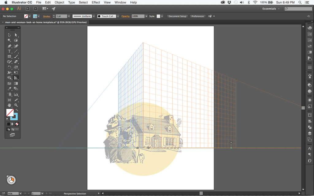
By using the nodes to adjust the horizon line and vanishing points, I matched the perspective of grid to that of the house, specifically the roof and chimney.
From there, two more grids were drawn on top, adhering to the newly adjusted perspective grid. These will be used as reference for the sketch.
STEP 2: SKETCHING THE ROBOT

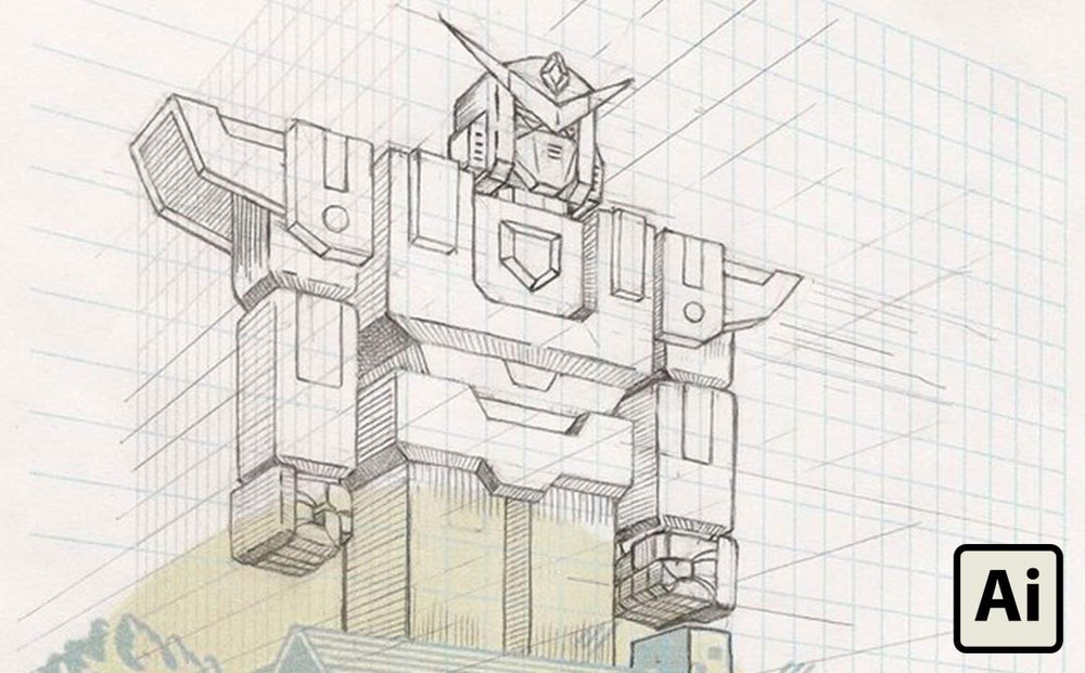
As I mentioned before, I love how robots are depicted in Japanese pop-culture, especially in the Gundam and Transformer series.
However, I did not want to go overboard with detail. An overly-futuristic robot with too many mechanical complexities would not fit with the classic American illustrational style of the Fizzlestock house illustration. I wanted my contribution to be of a similar look, ensuring that the whole depiction was cohesive.
Again, notice how my sketch fits within the perspective grid that I set up beforehand.
STEP 3. BRINGING IT BACK INTO THE COMPUTER

The pencil sketch is scanned in - resolution does not really matter since all of the linework will be re-done in Illustrator. In Photoshop, the hue of the image is set to colorized and adjusted to a light cyan.
STEP 4. LINEWORK IN ILLUSTRATOR

The edited scan is then opened in Illustrator, where the linework is reworked. I used RetroSupply’s VectorHero Ink Pen Illustrator Kit, choosing brushes that I felt best matched the quality of the linework in the Fizzlestock house illustration.
I should note that I once again created a perspective grid specific to the scene and used it to keep my illustration in perspective. You can actually see it faintly displayed as the orange and blue grid. 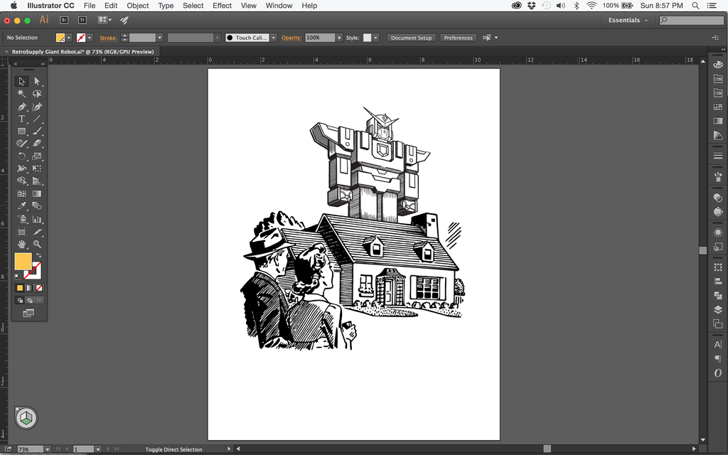
Ta-da! Linework complete!
STEP 5. FINISHING TOUCHES
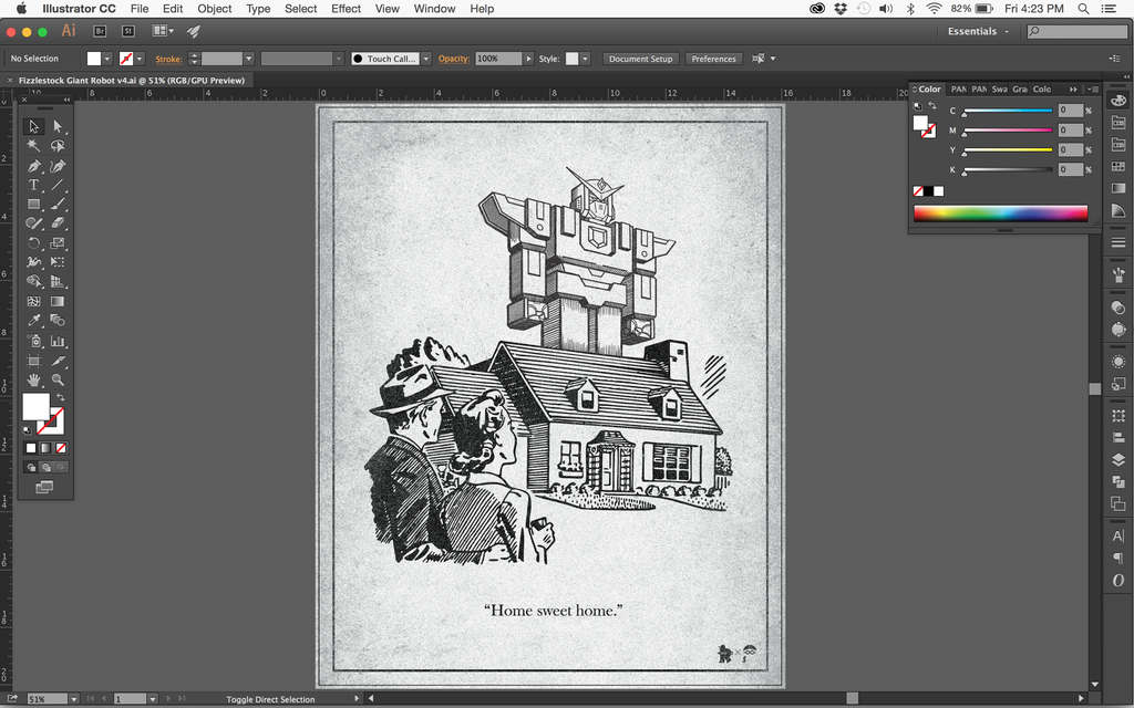
Now for some final finesse: add a nice texture on top and a witty little phrase (“home sweet home”) at the bottom. Instead of a signature, since this is a collaboration, I plopped the two logos down in the corner.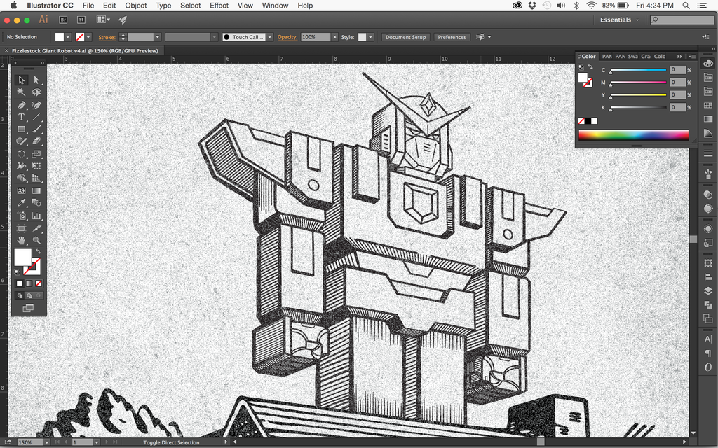
Detail shot.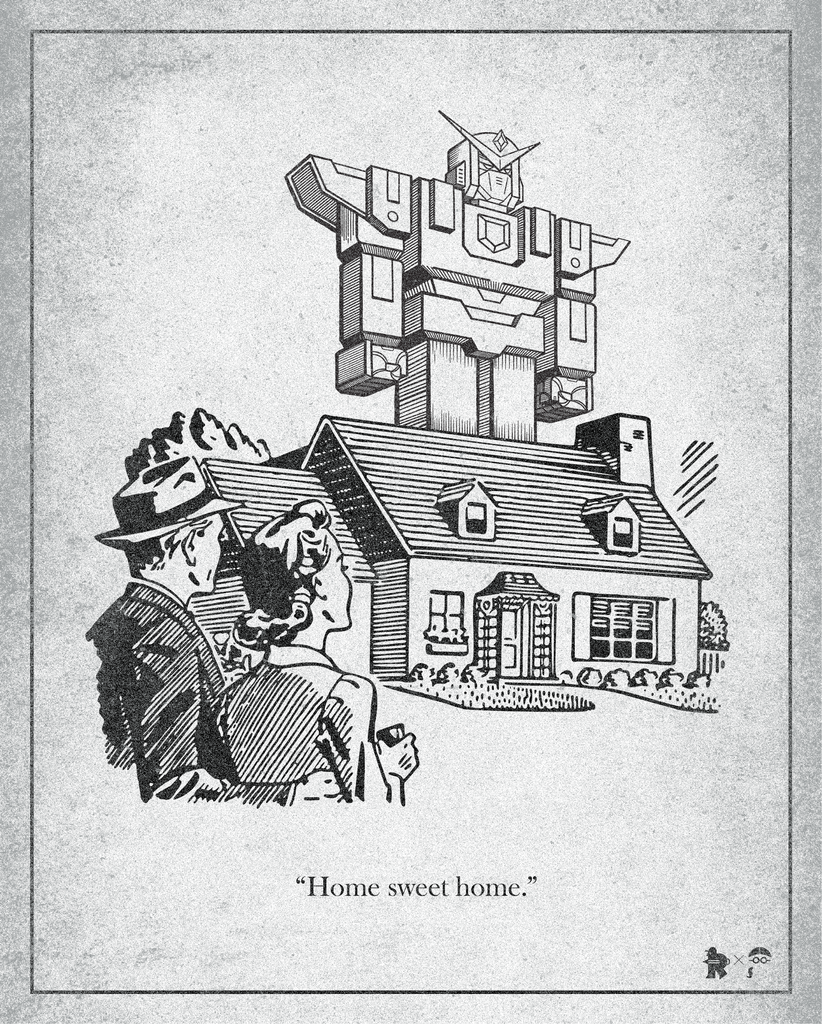
Done-zos! Originally I had the background set to a golden hue, but as you can see, I decided to go with more of a silver look.
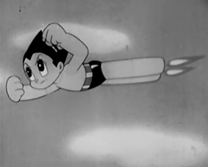
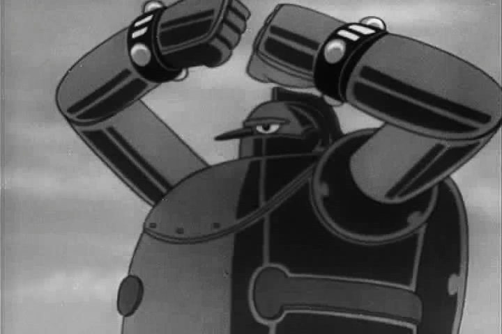
A bit of a homage to the old days of Astro Boy and Gigantor.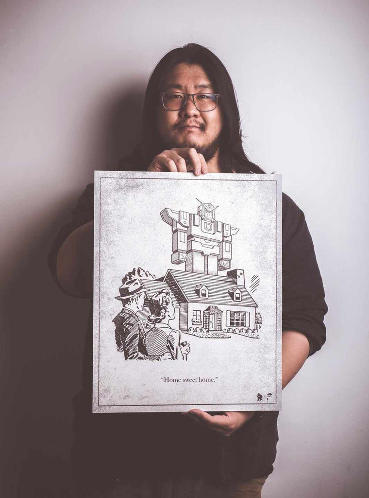
Looking to have this on you wall? Grab a two-color screen print (16” x 20”) at my online store. (Shout out to Clockwise for doing a great job on these prints!)
Thanks for reading! Now get out there and draw some robots!
About the Author
Jordan Wong (dba Wongface) is a graphic designer, illustrator and artist residing in Cleveland, Ohio. He specializes in illustrative work and is inspired by empowering narratives, humor and quirkiness. From art exhibitions, design contracts, and teaching in Pittsburgh (his hometown) to his time at Go Media and designing the sixth Weapons of Mass Creation Fest, he continues to create imagery that informs, inspires and delights.

