A Font That Pays Tribute to American Diners of the 20th Century
Diners… They’re as American as jazz and baseball.
Inspired by streamlined trains, diners first appeared in the northeast United States. They were pre-fabricated and ready to go out of the box.
Slap one down on an empty lot, flip the open sign, and you’re pretty much in business.
Diners are beautiful in a distinctively American way. But that’s not what really interests me. What I find most fascinating is the role they play in America.
- Inspired by American diner culture of the 20th century
- Created to tell uniquely American stories in your design and branding work
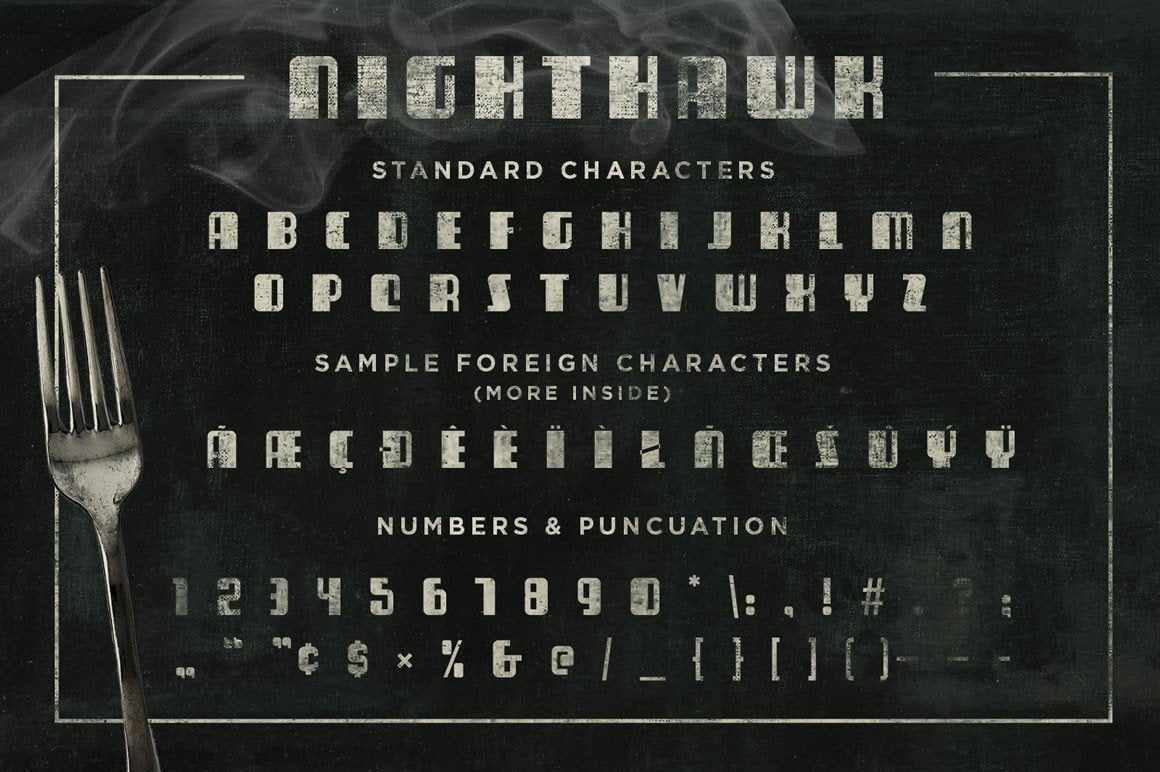
- Language support for US and Western Europe
- No brainer price (approximately the price of a slice of pie and cup of coffee)
- NightHawk and Over Easy is a single font. The two names reflect the different moods of a diner in the morning and late at night.
Number of fonts: 1
File Type: OTF versions of all fonts
File Size: 13.2 KB
License Type: Standard version
Foundry: Designers from Across America
The Two Weird Things That Make American Diners Special
For one, patrons come from a wide spectrum of socioeconomic backgrounds. Any given morning you could find a slice of America in the booths. From car mechanics to lawyers to house painters to doctors. All eating the same short order fare together.
But that’s not all. Because diners are part of a rare club. Real diners were open 24/7 - a club reserved for a select group of establishments including nightclubs, bars, and hospitals.
As a result, you got the morning rush of commuters picking up an affordable breakfast and in the wee small hours of the morning, you had bar patrons stumbling in for a greasy meal to absorb the alcohol before work the next day.
In fact, it could be argued that if you knew nothing about America a diner is the fastest and most immersive way to understand the country.
This Font is a Tribute to American Diners
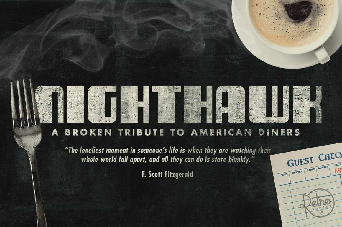
So it’s with that spirit we bring you a brand new font. We call it Nighthawk.
Nighthawk (a name that pays tribute to Edward Hopper’s classic painting Nighthawks) reflects the late night, melancholy, feel of lonely bar patrons making their way home.
This font is our tribute to an American institution. And like the diners themselves the font has passed through the hands of designers from all across America. Each one helping to tell the font's story.
The Font Made by Designers from Across America
From original designer Scott Fuller, in Atlanta, Georgia. To myself, in Vancouver, Washington. To Dathan Boardman, in Oh Claire, Wisconsin. To Suzanne Sarver, in Mobile, Alabama.
This is a simple font like the simple fare served at American diners. But it’s got soul and it stands out.
Plus, you can pick it up for about the price of a slice of apple pie a la mode and a hot cup of coffee.
Grab it now and take a little piece of diner culture with you.


